Text + Image Components
Banner Component (only in Grid)
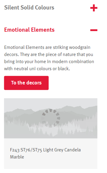
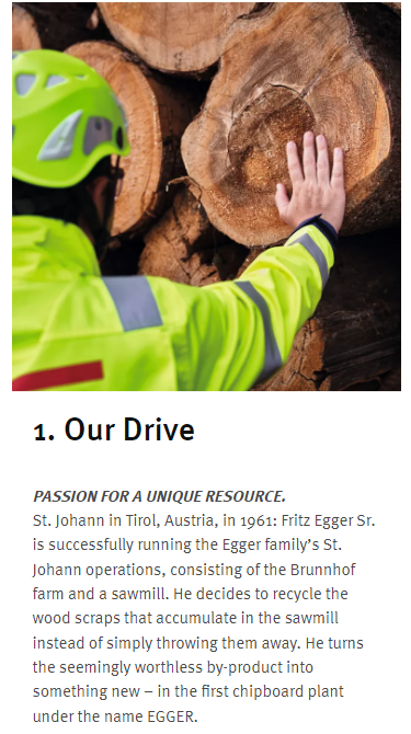
This component combines an image with text. It can either be horizontal or vertical as can be seen in the image. Links are optional.
Mobile Version
Banner Dropdown (Hybrid)
This component allows to open up an additonal area when clicking on i.e an image within the Banner component. You can add up to four images per banner dropdown.
Mobile Version
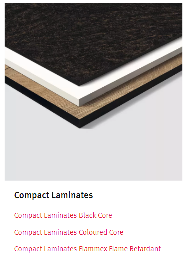
Product Teaser (only in Grid)

We have the option to create this manually or automatically when a product is integrated in the PIM. Consits of an image and a short headline that links to another page.
Mobile Version
Product Teaser List (Hybrid)
It can be decided whether the items within the product teaser list should be small, medium or large.
Mobile Version
Image Text Overlay (Hybrid)


When clicking on the image the overlay opens up. This can either be just a text with no image in the background or and additonal image with "pop-up" text.
Mobile Version
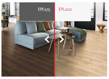
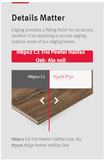
Simple Image Compare (Hybrid)
The simple image compare component makes it possible to inlcude two images and leave it up to the user of how much they would like to see of each image by dragging the little arrows. A description can be added for both sides and the split of the image is always in the center.
Mobile Version
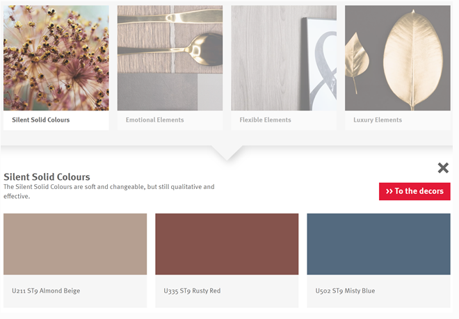
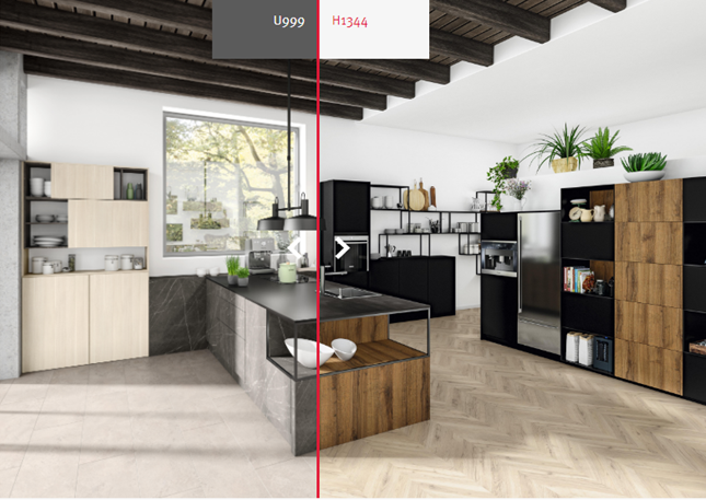
Multi Image Compare (Hybrid)
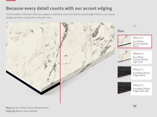
The multi image compare component is similar to the simple image compare component. For this component however, it is possible to have multiple images that can be compared within one component. On the right side there is a list of other images that also can be compared. A Thumbnail can be individually selected for each comparison-duo.
Mobile Version
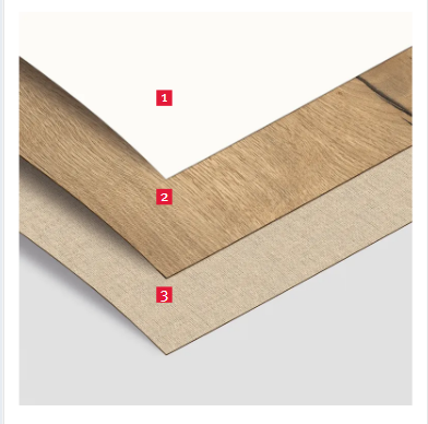
Simple Annotated Image (Hybrid)
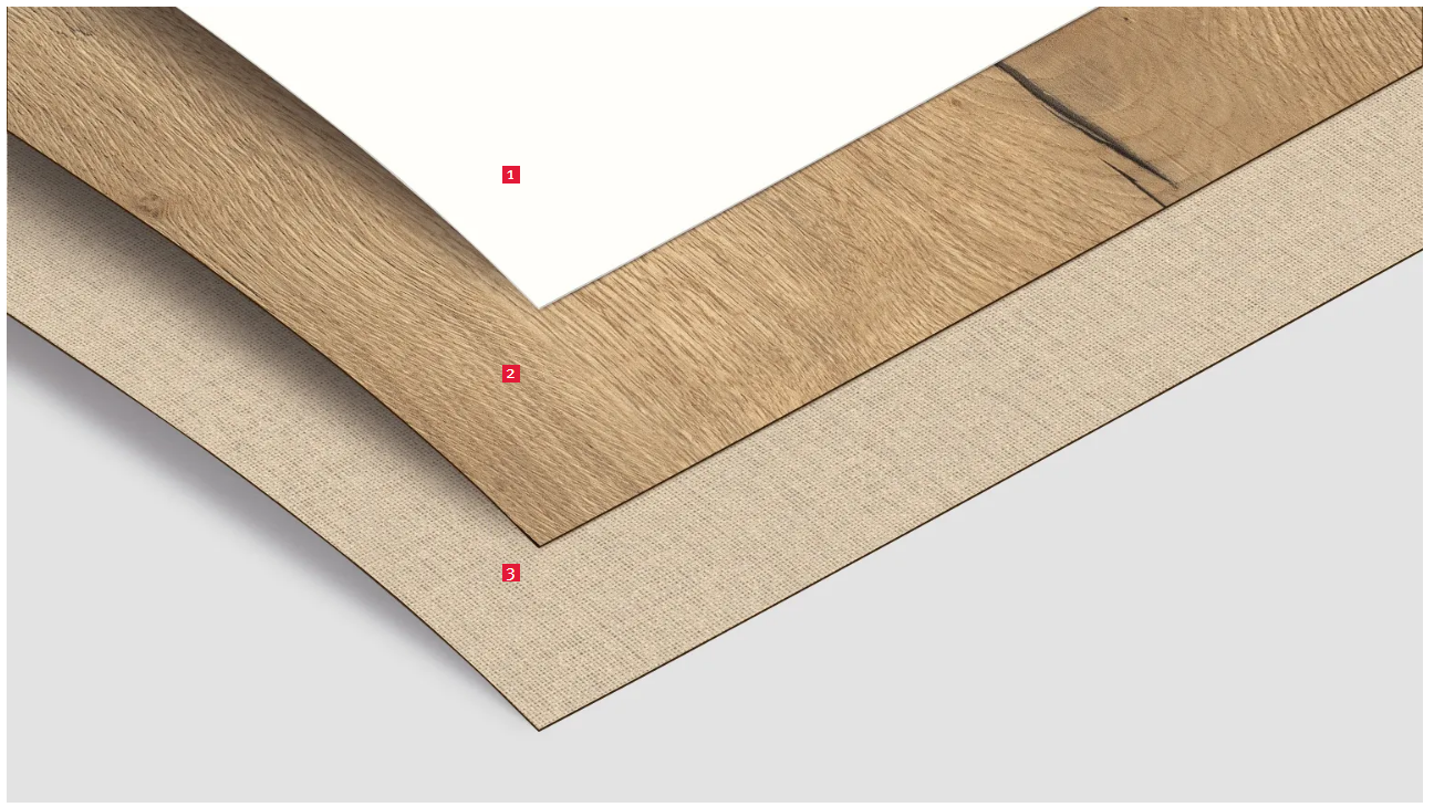
In this component, points can be set on an image.
Mobile Version
Text Annotated Image (Hybrid)
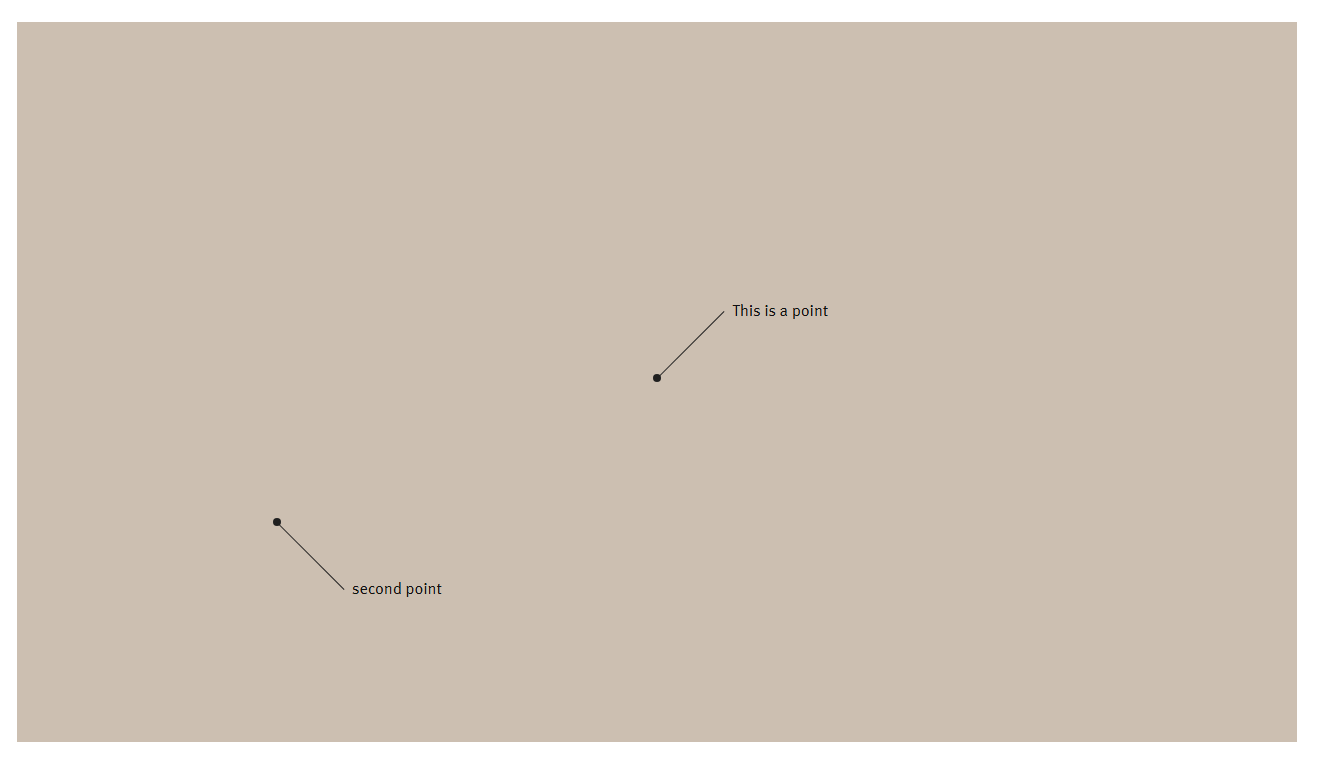
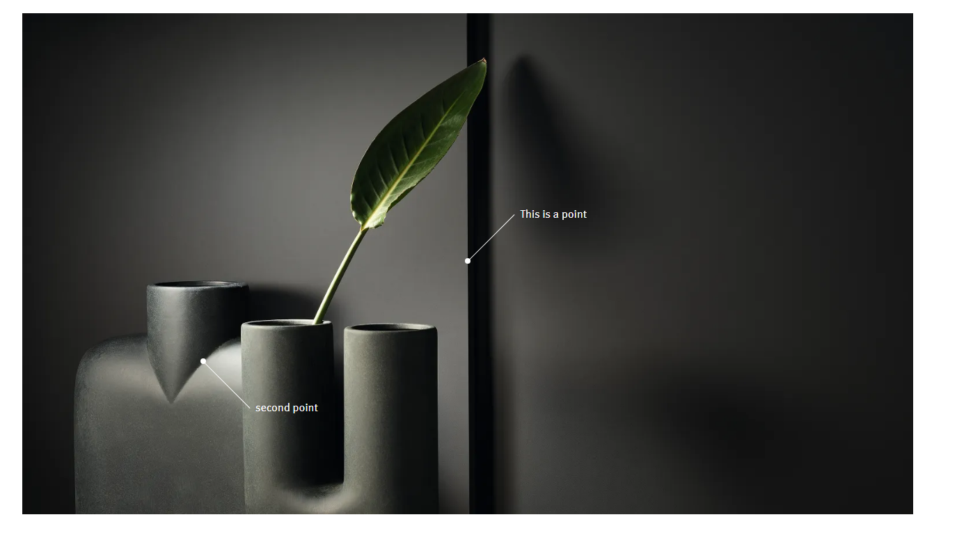
In this component, points with text can be set on an image.
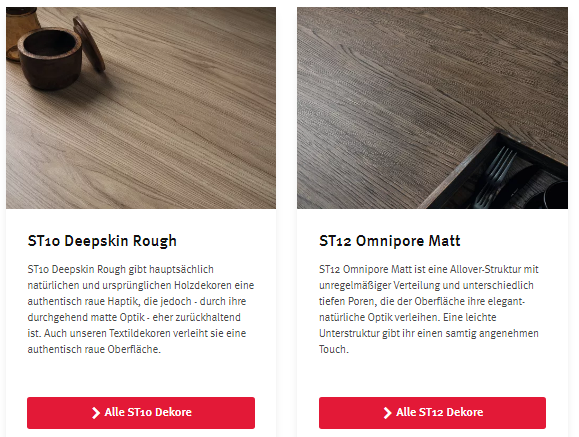
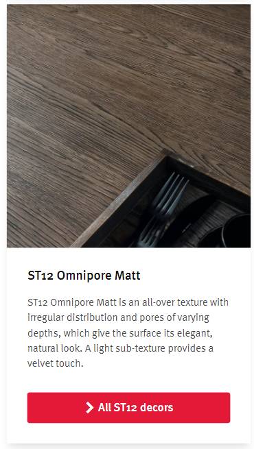
Text Image Box (Hybrid)
Here the image can either be to the right or to the left side of the text. It can also be structured in a way that the image is below the text.
Mobile Version
Progress Indicator (only in Grid)


With this component it is possible to visualize a specific progress. You have the option of either showcase an increase or decrease of somehting or a more simple visualization like a general progress.
Mobile Version
Product Comparison (only in Grid)
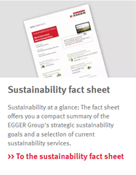
This component features an image, text (also bullet points) and a link. Additional tags, a second link are optional.
Mobile Version
Bannerlist (only outside of Grid)
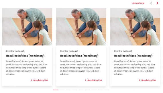
The Bannerlist gives us the option to show more than one teaser with an image, text and link. If there are more than three elements the user can click through all elements via the arrows at the top.
Mobile Version

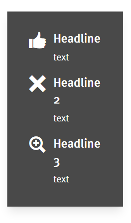
Linked Teaser List (Hybrid)
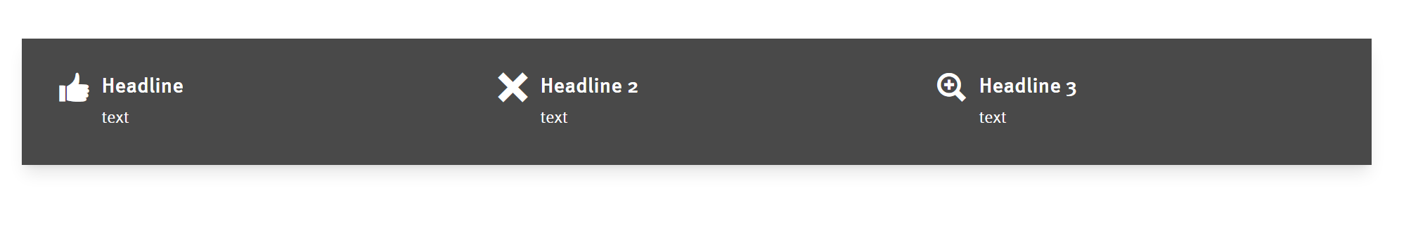
The Linked Teaser List can show icons and text, optionally you can add a link to the icons.
Mobile Version